Creating Codye: from lockdown to the Mac App Store frontpage
07 Aug 2020Creating Codye: from lockdown to the Mac App Store frontpage

To be completely honest, I was not planning on developing new Apps this year. I had stopped paying for my developer account and had no time to maintain several projects. But while lockdown has brought many things to a halt, It has been an opportunity in disguise for me.
On June 15th, 2020 I was able to release my latest App Codye, and It has been a wild ride for me so far. In this article I'll outline three key aspects I've found are pivotal to the success (or lack thereof) of an App.
App Icon
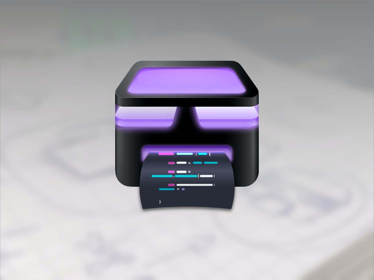
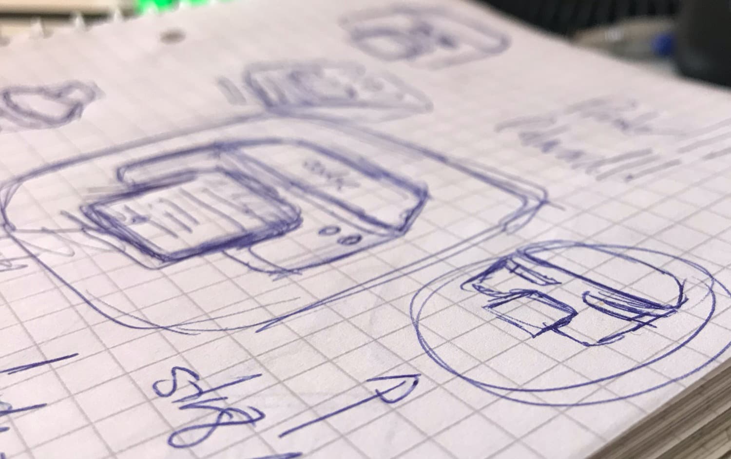
The very first thing I made for codye was the Icon. Insipired by Michael Flarup's iconic style, I followed his excellent App Icon course and after a few hours of sketching and Sketch, I landed on a cool concept:

Sketches and Iterations from first square to current design.
The first of many (small) milestones came when Michael himself saw the design on Twitter and even gave me some tips!.
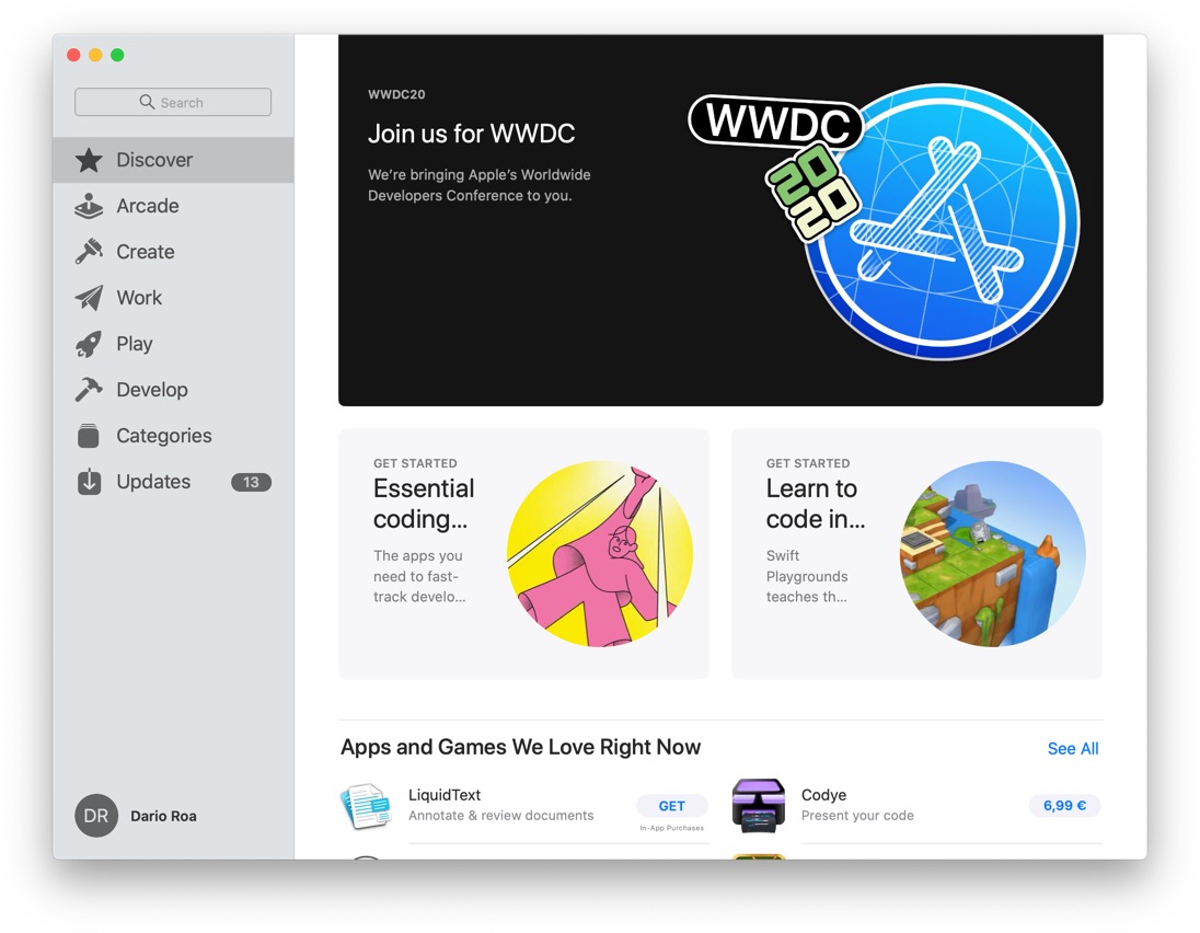
Another shocking moment came when seeing this very Icon on the frontpage of the Mac App Store on launch day:

While I still think the icon needs a few tweaks and better scalability, I can say It feels unique and different, and it even defies de squircle shape when placed in a black background on iOS:
How the icon looks on a dark background. Notice how the side edges "merge", thus creating the illusion of a taller rectangle, more than a squircle.
I'm absolutely sure Codye would not have been as successful without its icon. I think it's key to instant recognizability and building a brand. So this is what I'm going to do when building all my upcoming App Icons:
- Make it fun and try to stay away from white backgrounds. Rich, textured design is making a comeback, and with it the permission to go beyond glyphs and boring shapes.
- Take a familiar concept and spin it. In this case, it was a printer.
Pick the right platforms
This might seem like an obvious question if (like me) all you know is iOS and so you'll have to develop for iPhone and iPad. This was my initial idea, but it was incredibly shortsighted given the nature of Codye. It's an app for programmers, who spend the vast majority of their time in front of desktop computers (duh). Unsurprisingly, thanks to the Catalyst system, macOS has become the main platform for Codye, with 80% of total usage.
I also believe building with Catalyst might have been a reason why the App was showcased on the Mac App Store on the first day. And despite recent controversies, this has been the single most powerful boost for the promotion of Codye. As of 7th of August, it has had a total of 4.145.618 impressions on the App Store (it stayed on the frontpage for a few weeks) and has driven 77% of the App's sold units. That is more than 8 million eyeballs on my icon.
Needless to say, I would never be able to reach an audience this large on my own. Picking macOS and Catalyst has meant 80% of the busniess generated by Codye. So, before opening a new Xcode project, or a new Sketch file, I think it's really important to ask yourself:
- Who are my users? - > Developers
- What are they doing (most of the time)? -> Sitting at their desks, in front of a computer
googling StackOverflow questions - How would this help them? Does it fit their workflow or do they have to go out of their way to use your product? -> Codye is a huge time saver for people who prepare presentations or blog entries. It's a steal given the amount of time and fiddling it can save, and can even make your content look and feel more professional.
Pick the right business model
It's easy to get overwhelmed with the options for pricing digital products. I certainly was, and this is where I think I made a big mistake.
Since my main aim was releasing before WWDC on June 22nd, I rushed the most basic features to get it out the door before all the attention was placed on the conference. This meant I could not spend 1 or 2 weeks integrating subscriptions or In-App Purchases into the App, so I just chose the paid upfront model.
In retrospect, this is a model that just pales in the long term. There was the usual Launch Hockey Stick, and since then downloads have been slowing down to a crawl. And for a good reason.
How would anyone pay for Codye without knowing what the 180 languages and 100 themes it offers are? I know I certainly wouldn't. Shortly after the initial release It became obious I had to switch to a different system.
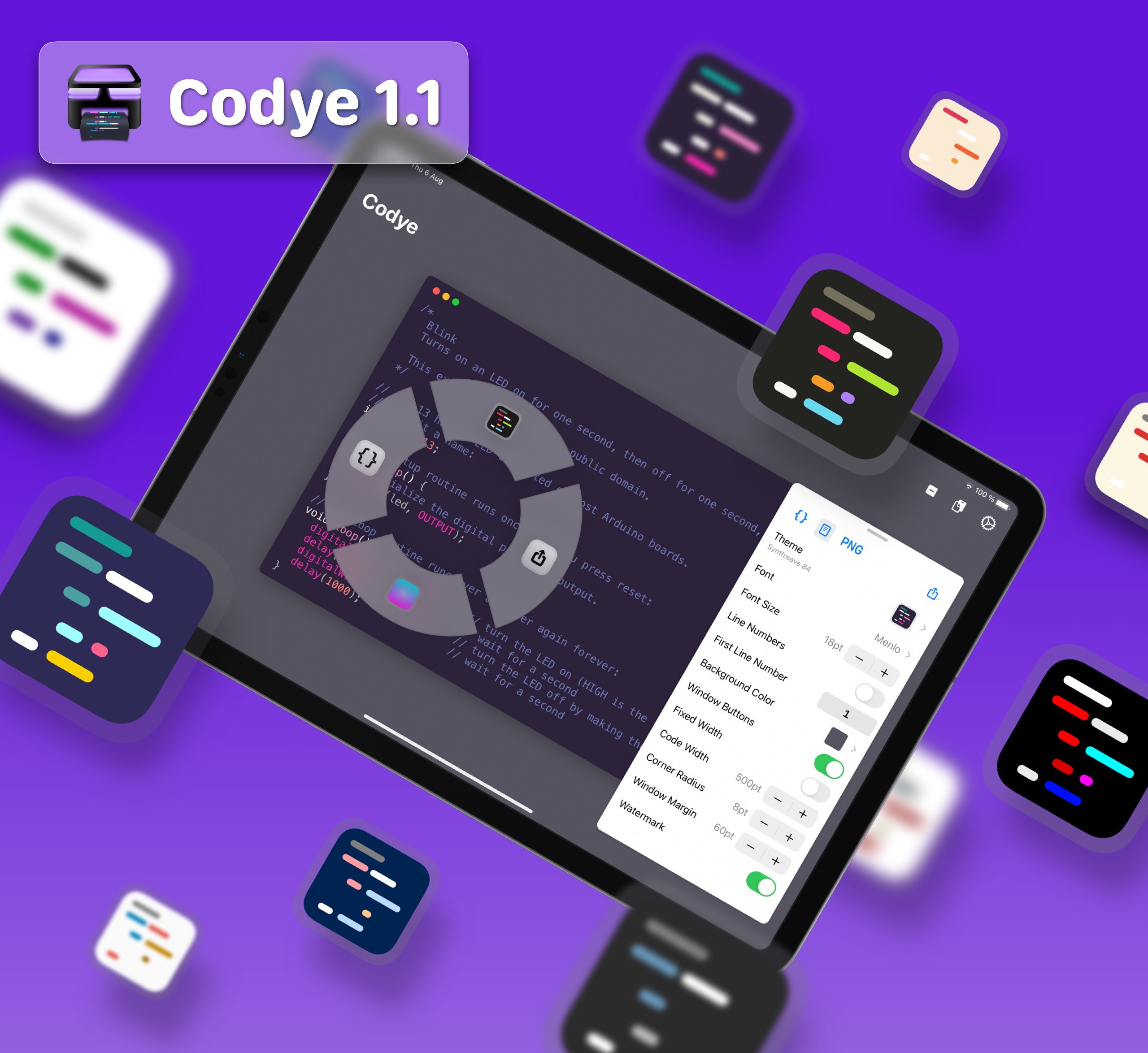
With the release of 1.1 today, Codye is now free to try (and use) for everyone, with optional In-App Purchases. It's much better to have non-paying users than no users at all.
So, with this in mind, here are my takeaways:
- Give before asking. Allow users to come in and see, touch, and experience your product before paying anything.
- Think about exposure. A one-person shop needs more people to promote your product, so try to turn your users into promoters by word of mouth.
- Make attractive screenshots. The initial screenshots for Codye on iPad were quite stale, which might explain why the App is more popular in iPhone than iPadOS.
What's next?

I can't wait to keep iterating on this app, and continue learning about so much more than just code and design. Why don't you give it a try 😄?.
 Share on Twitter